The Concept:
As a commuter, I found myself frequently caught off-guard in the rain or without a jacket as the temperature changed from home to work. This project was created as part of my coursework with Springboard's UI/UX program, where I endeavored to create an app that would help the user make informed decisions pertaining to the weather and proper attire.
Secondary Research:
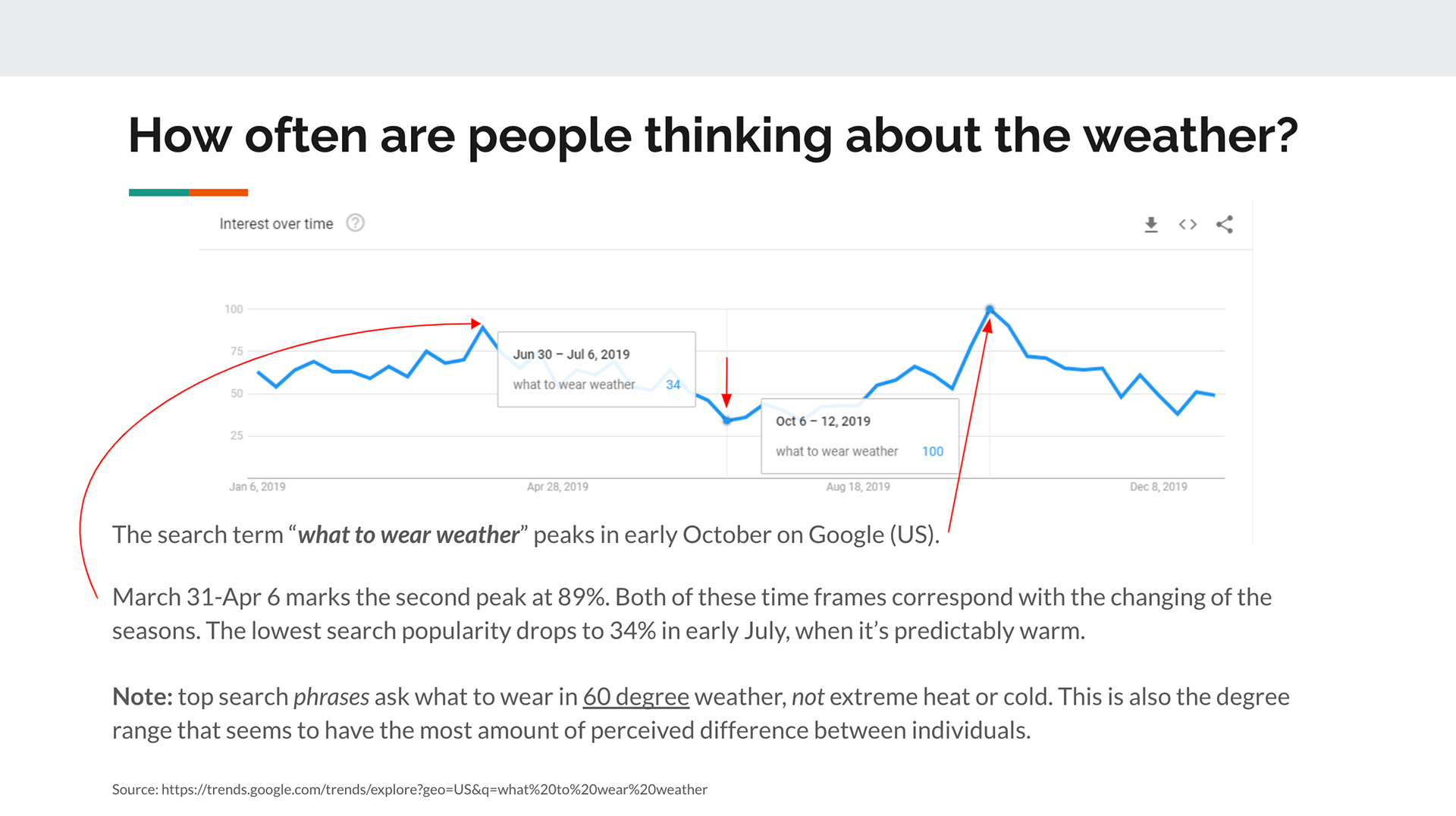
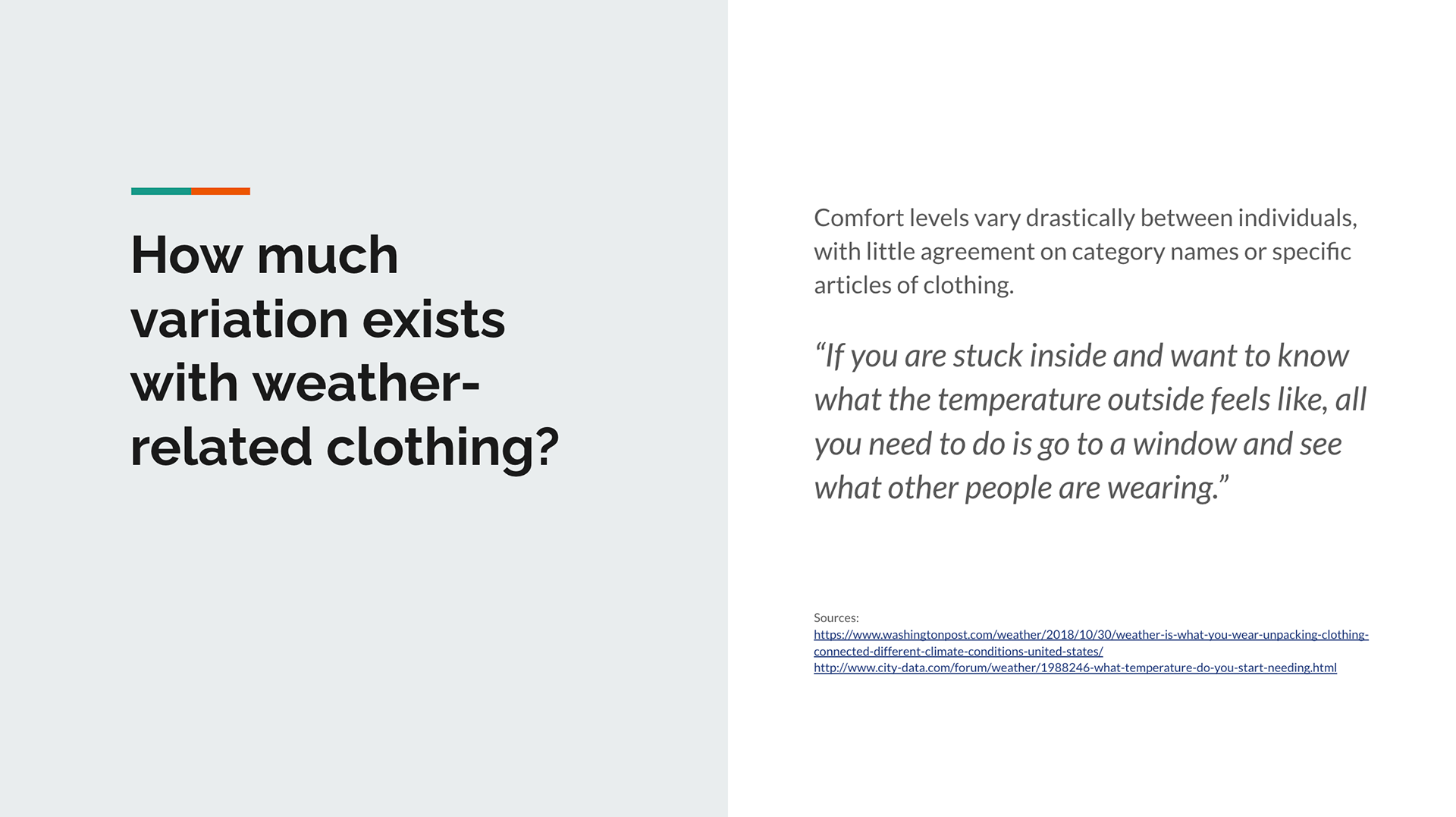
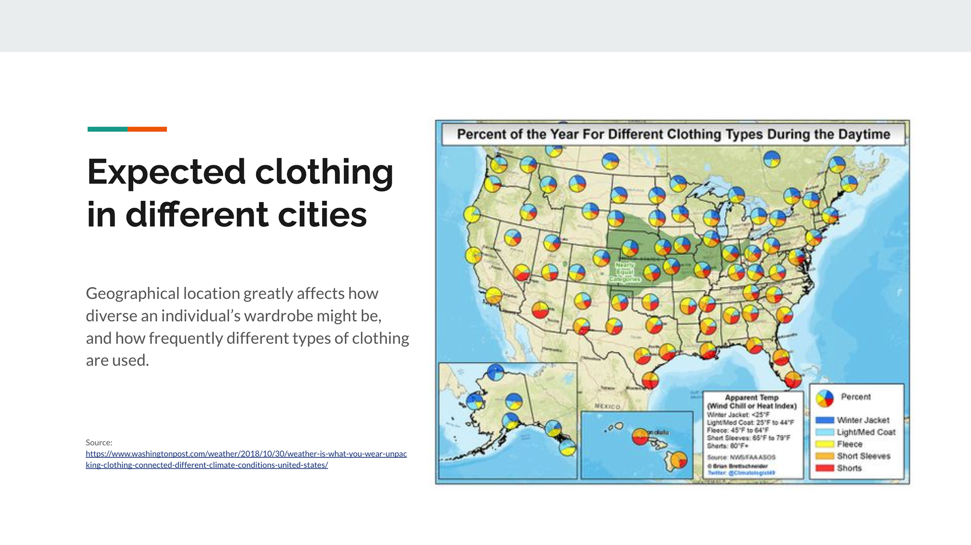
Identifying the problem space and the existing research related to cognition around weather and outfit choices.
The full slide deck presenting my research findings can be viewed here.
The full slide deck presenting my research findings can be viewed here.
Primary Research:
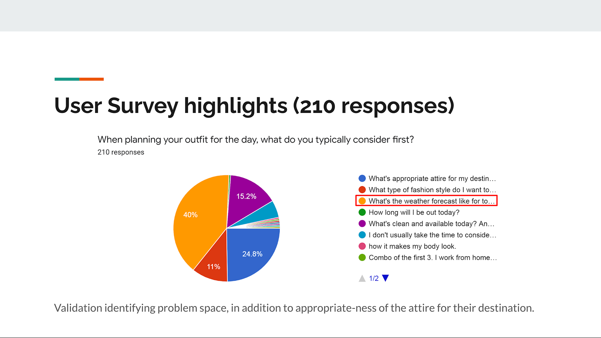
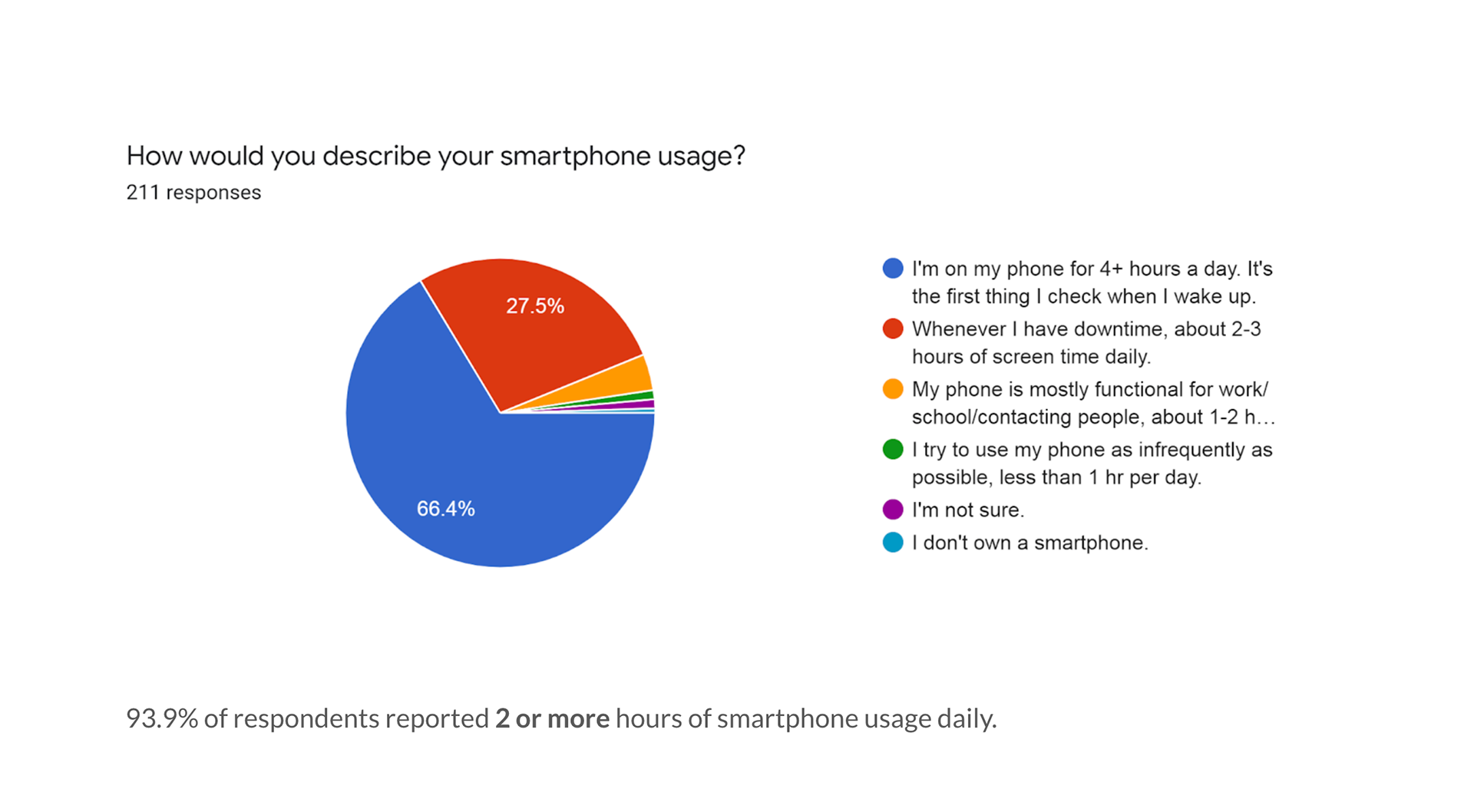
A survey was created and sent out to collect responses indicating people's daily outfit selections and routines as they relate to weather. The purpose was to validate the problem space, and determine what possible solution spaces exist. To my surprise, while I often struggle with feeling too cold or being wet, most user survey results expressed the most discomfort with overheating and humidity. View research plan.
User Interviews:
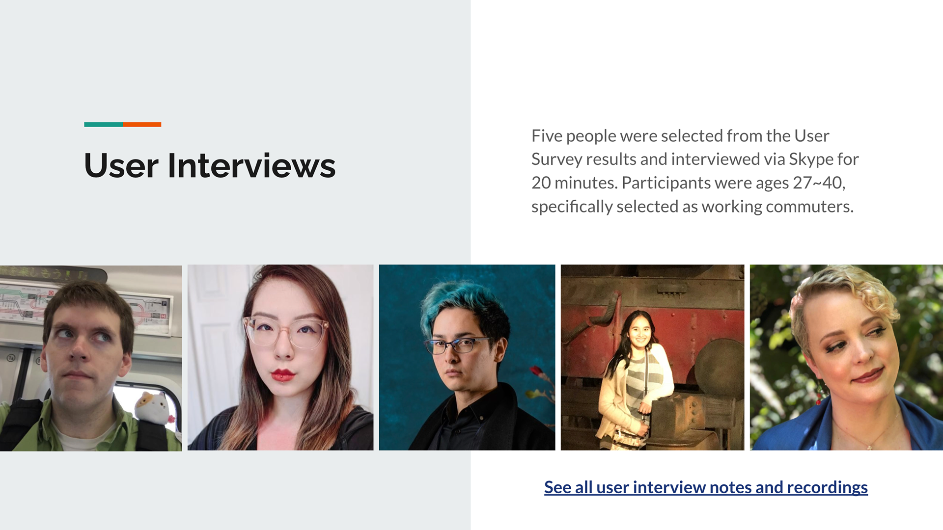
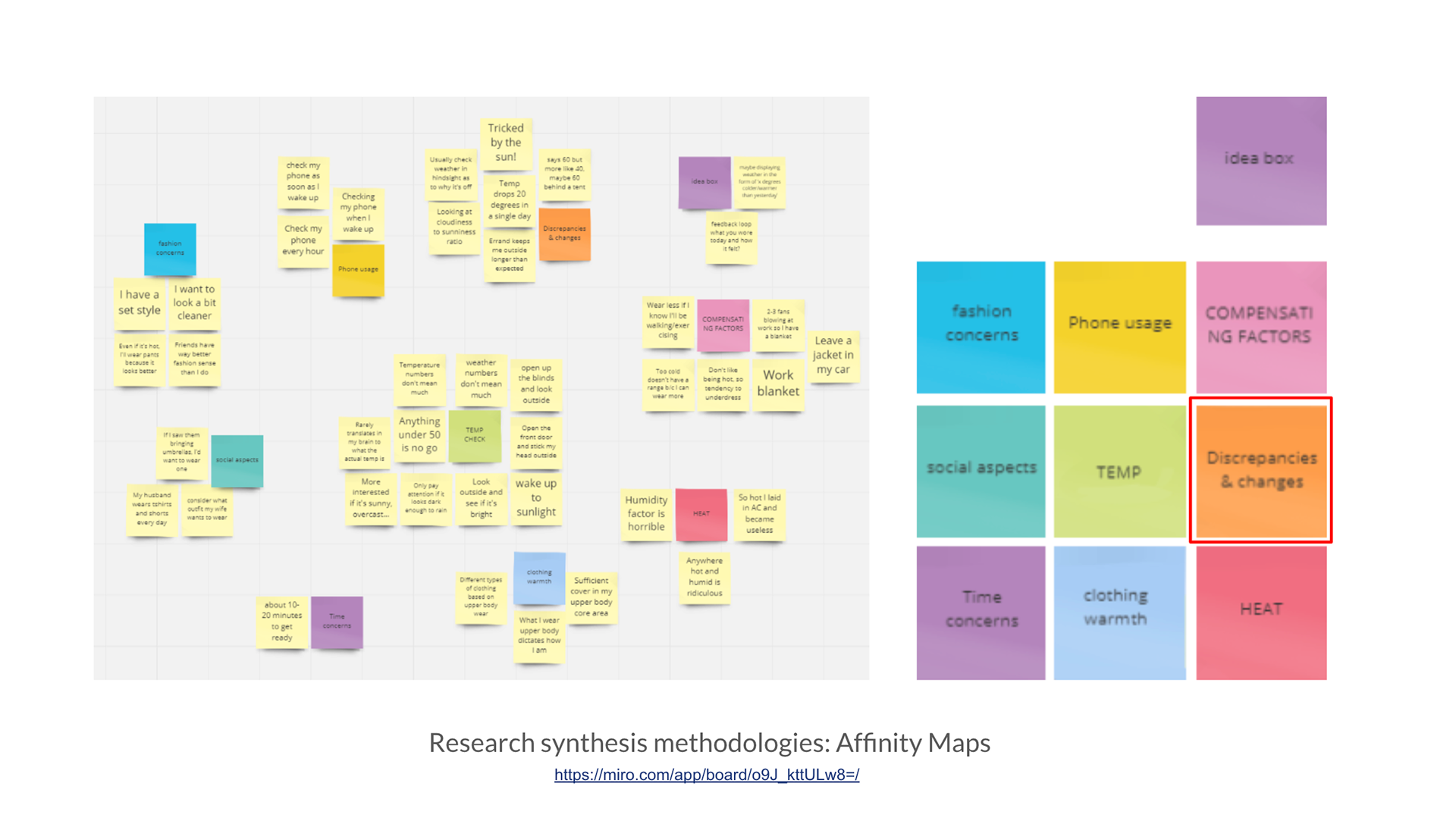
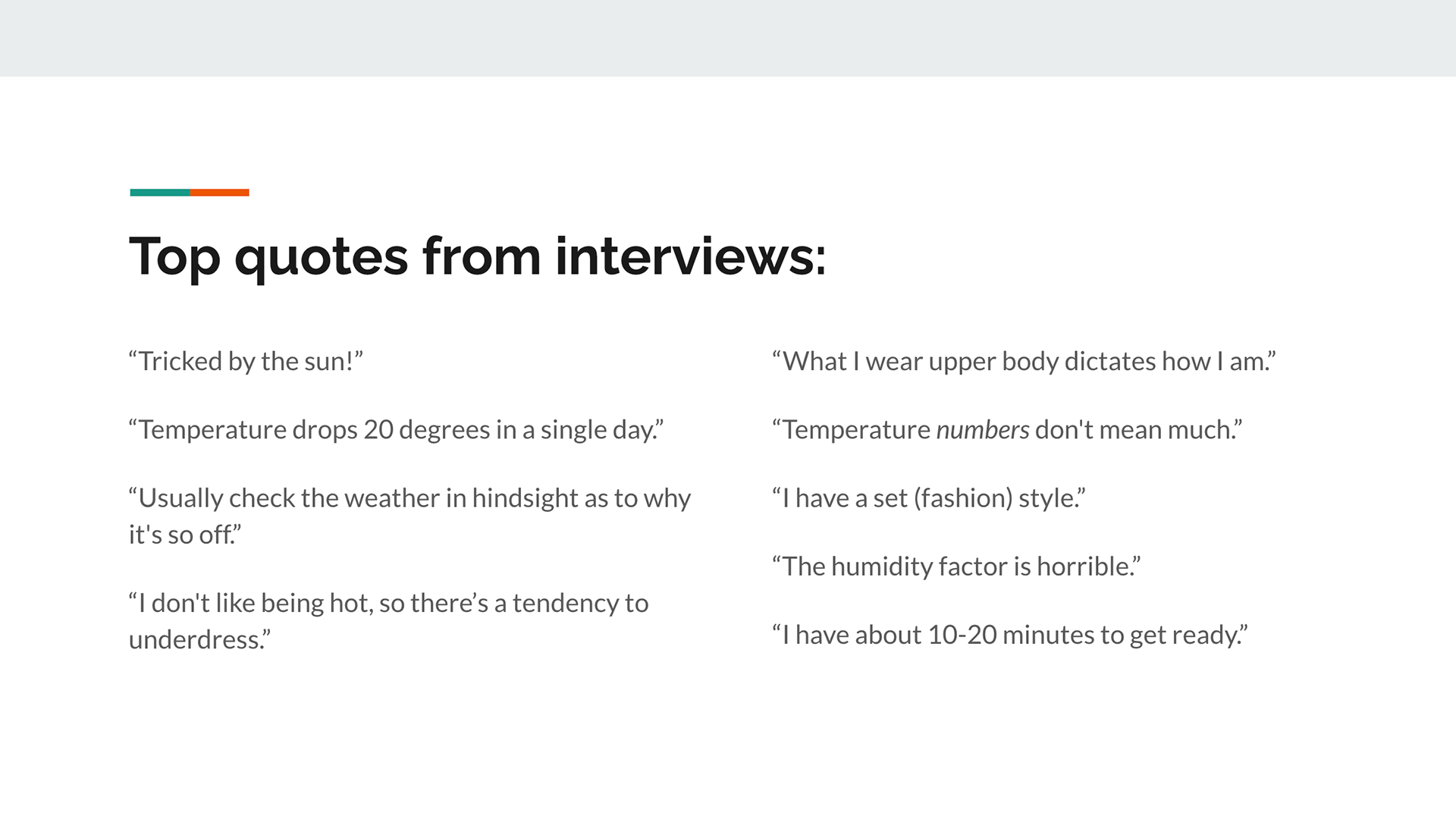
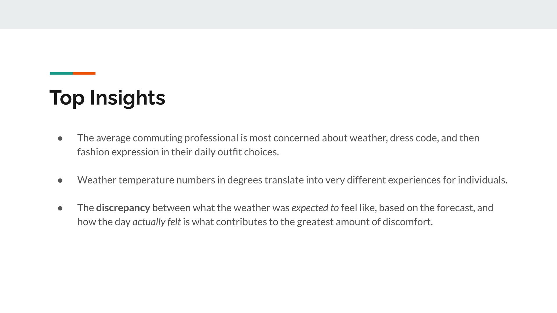
From the user survey results, 5 people were selected as working commuters to gain insight on understanding the problem space. Standout quotes and repeating themes were organized in an affinity map, with an emerging pain point revolving around temperature discrepancies (the numerical value vs. feeling) or sudden changes as the root cause. View full User Interview notes and recordings here.
User Personas:
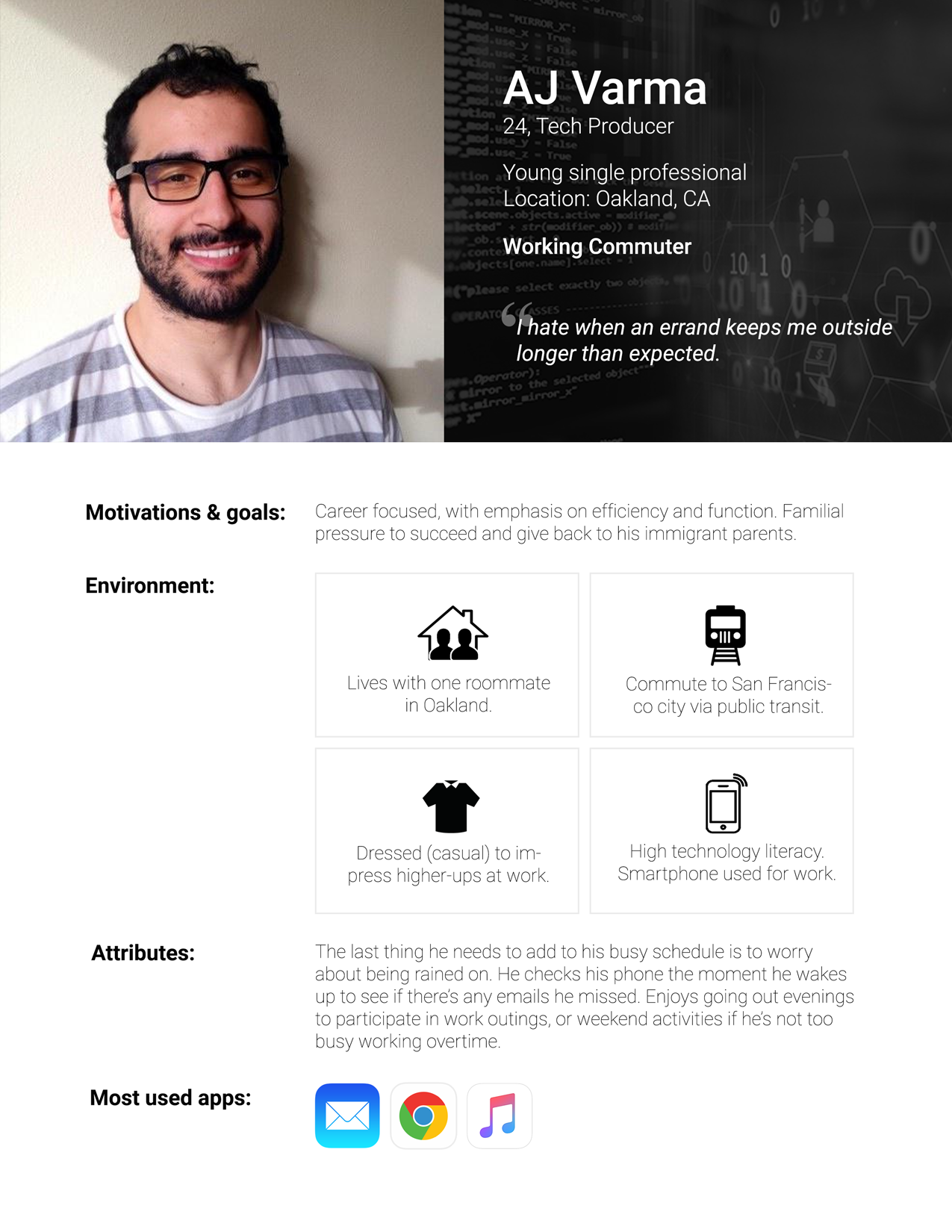
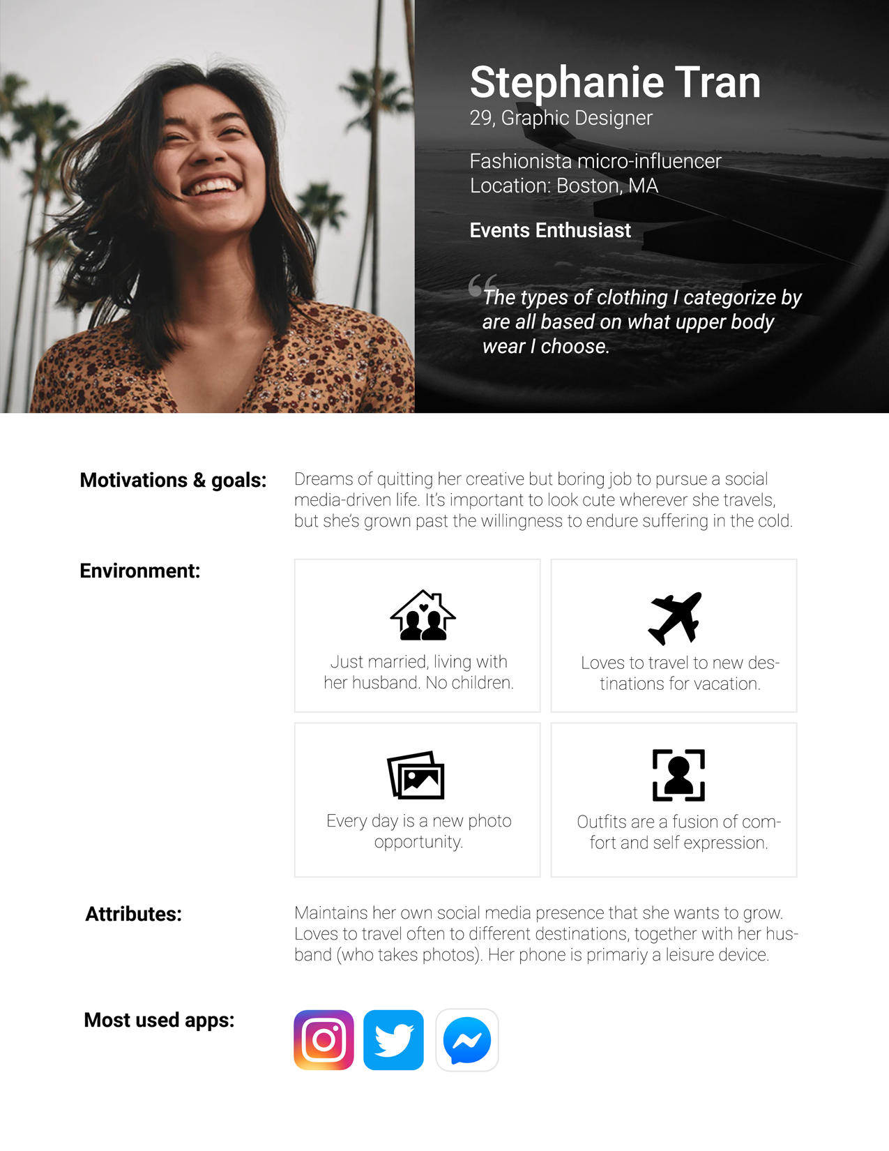
Two personas were generated from the user research to identify the Primary user and the Secondary user.
View User research presentation here.
View User research presentation here.
User Flows:
I wanted to create an app that could deliver information in an easily digestible format, allowing the user to ultimately make an informed decision. Diagraming my app's first time user flow:
Wireframe Sketches:
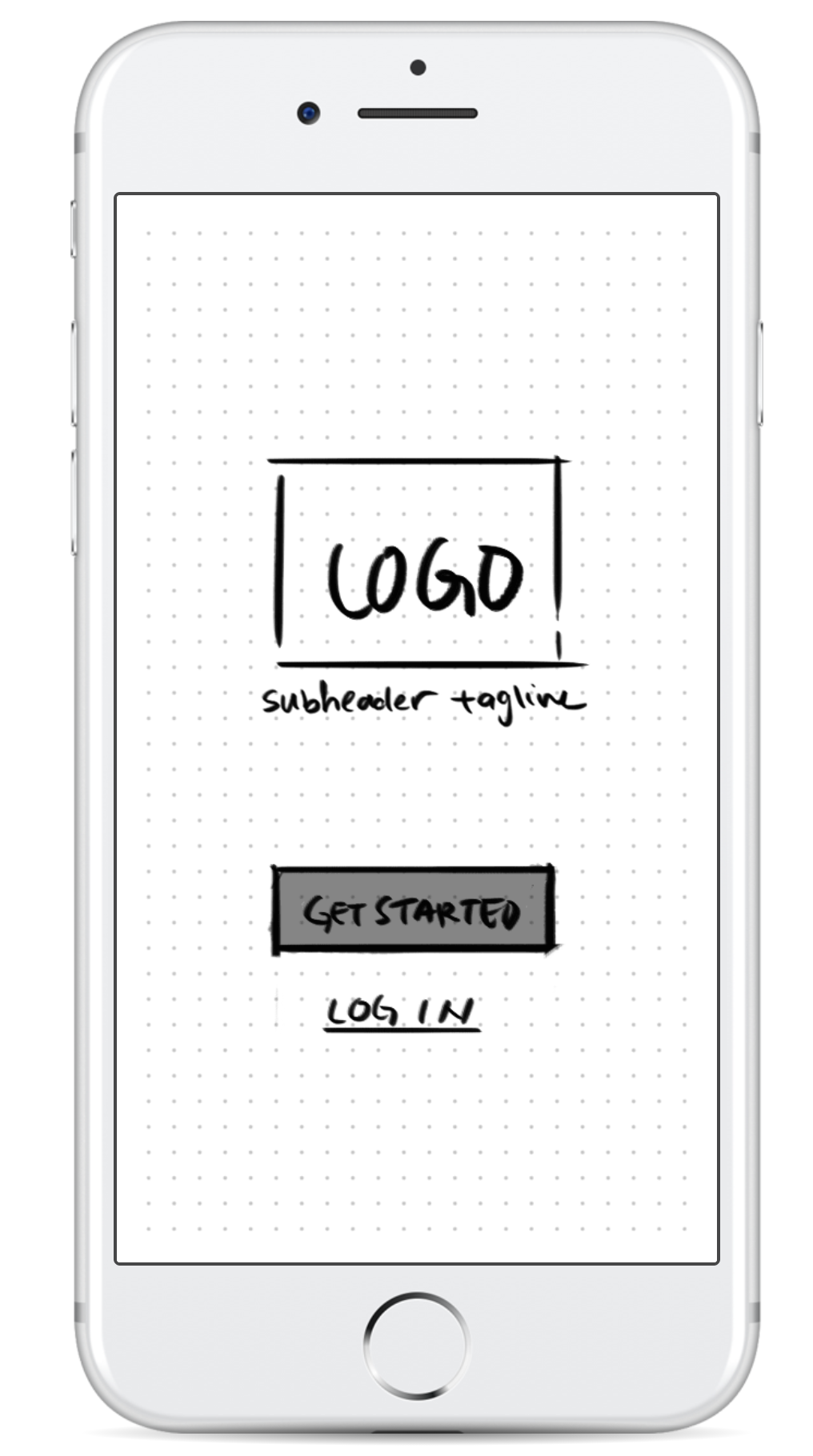
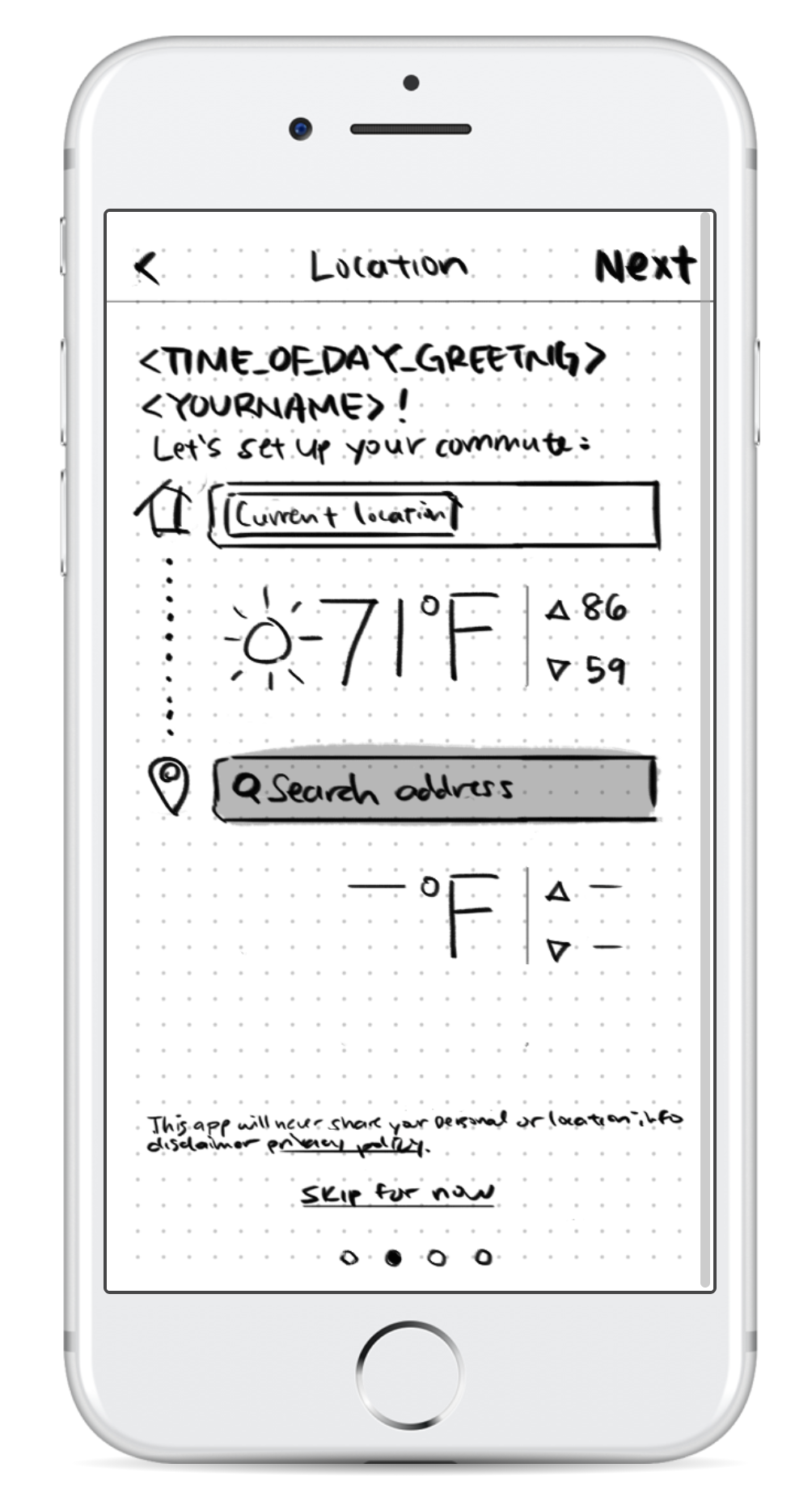
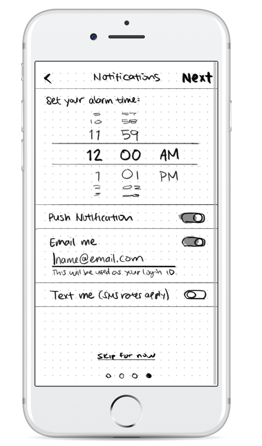
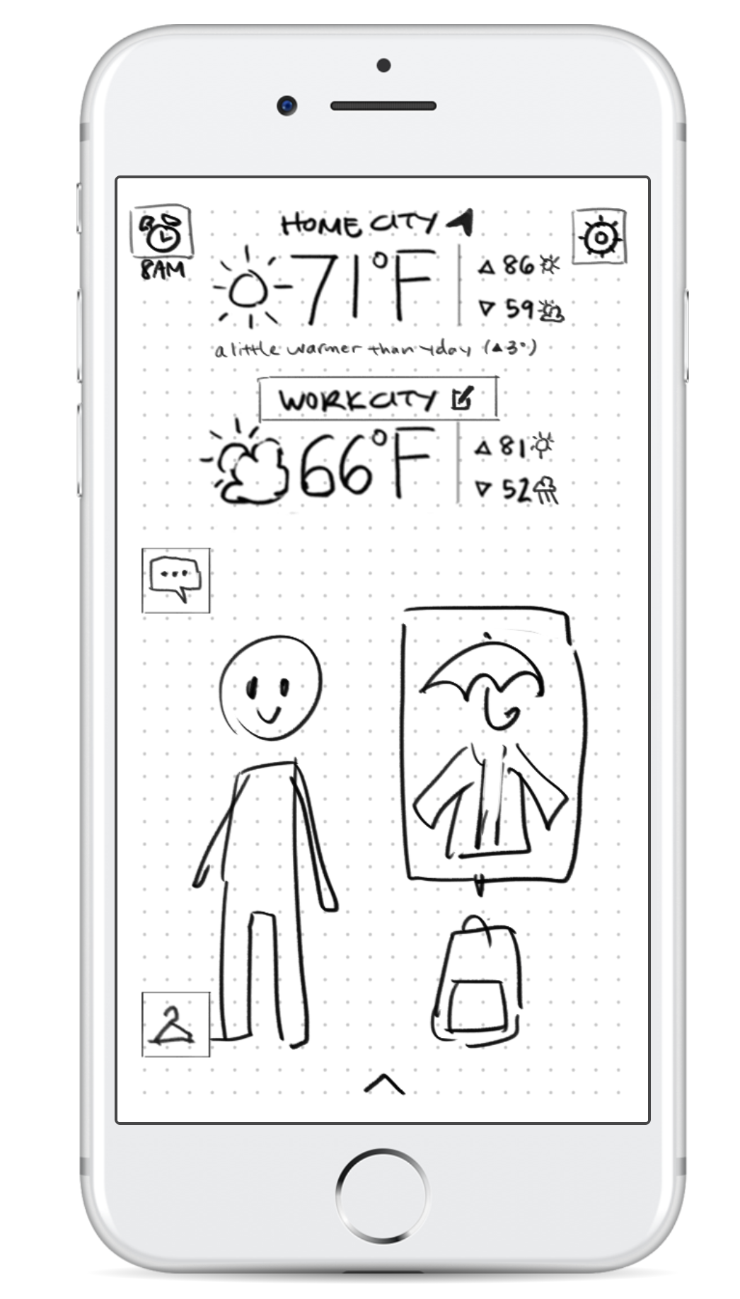
Wireframe sketches were created in Photoshop, following the user flow above to create a quick-and-dirty interact-able prototype for usability testing. You can view the prototype here.
Wireflows (low-fidelity):
Based on learnings from usability testing with the interactive sketch prototype, wireframes were created with a slightly adjusted user flow. The purpose of the app is to suggest outfits and carry-on essentials based on the weather forecast in two different locations. View wireframe screens in Figma here.
First time user flow:
Navigating from Landing Page to Settings menu:
Edge Cases:
A few edge cases were identified during the wireframe creation process, specifically around consistency in exiting the avatar saving flow, and for users who needed to quickly change their target destination if they had been transferred to a different office (primary persona), or planned on taking a vacation (secondary persona).
Branding and style guide:
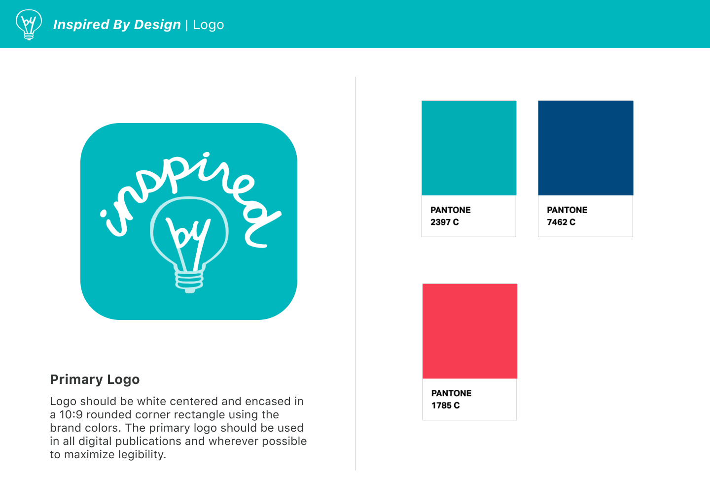
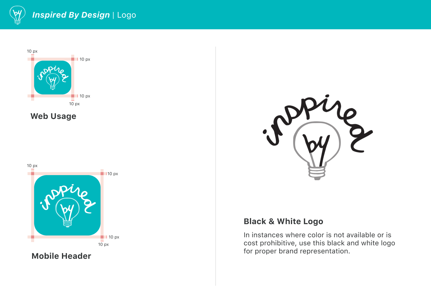
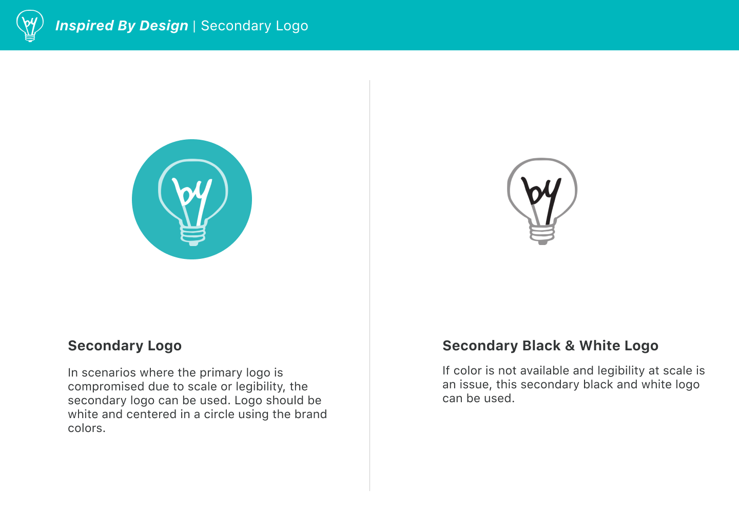
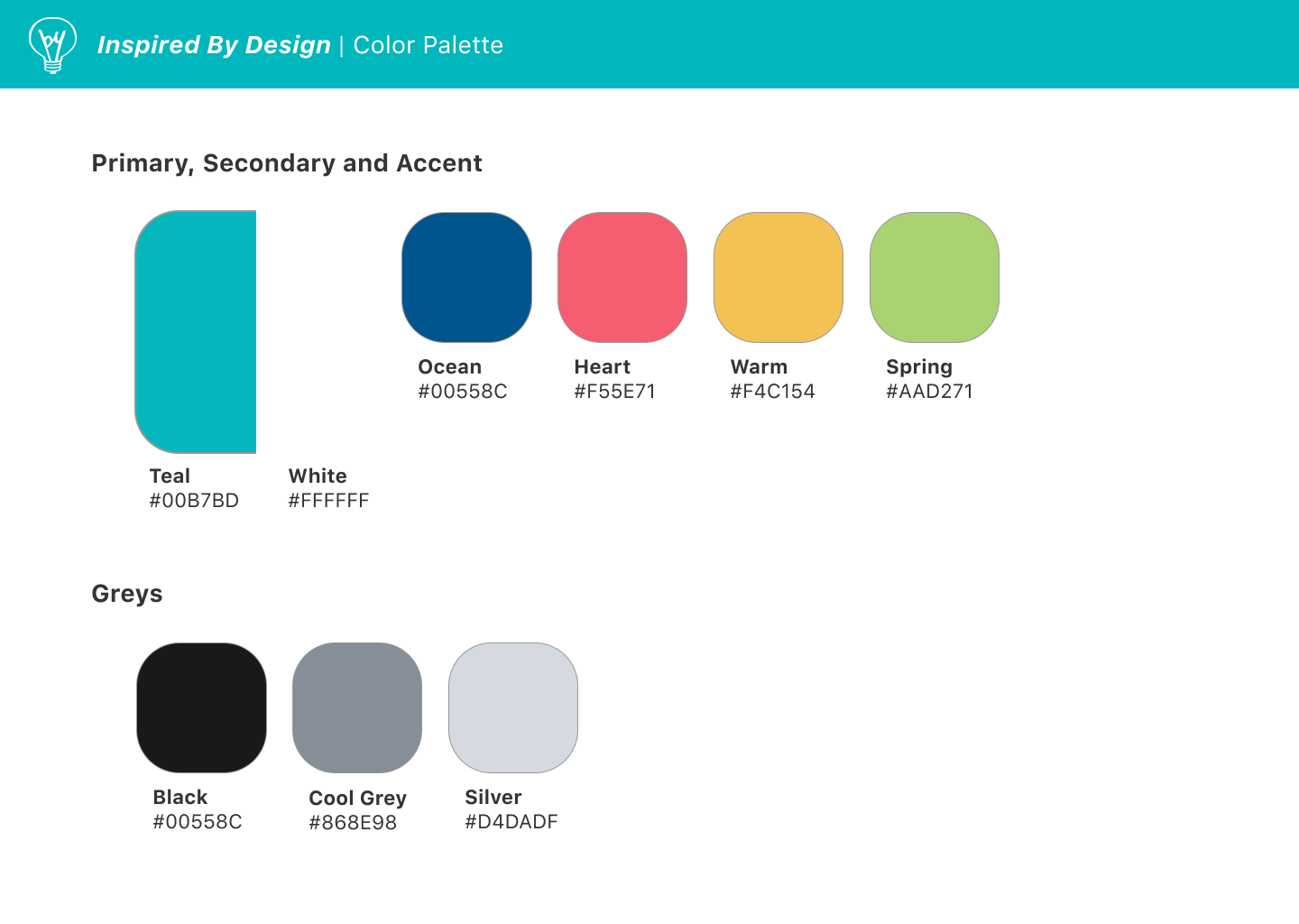
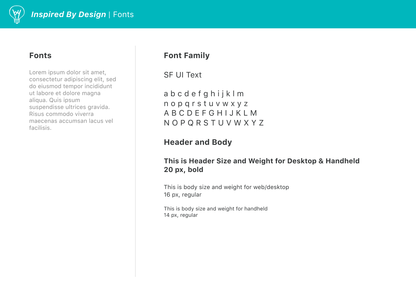
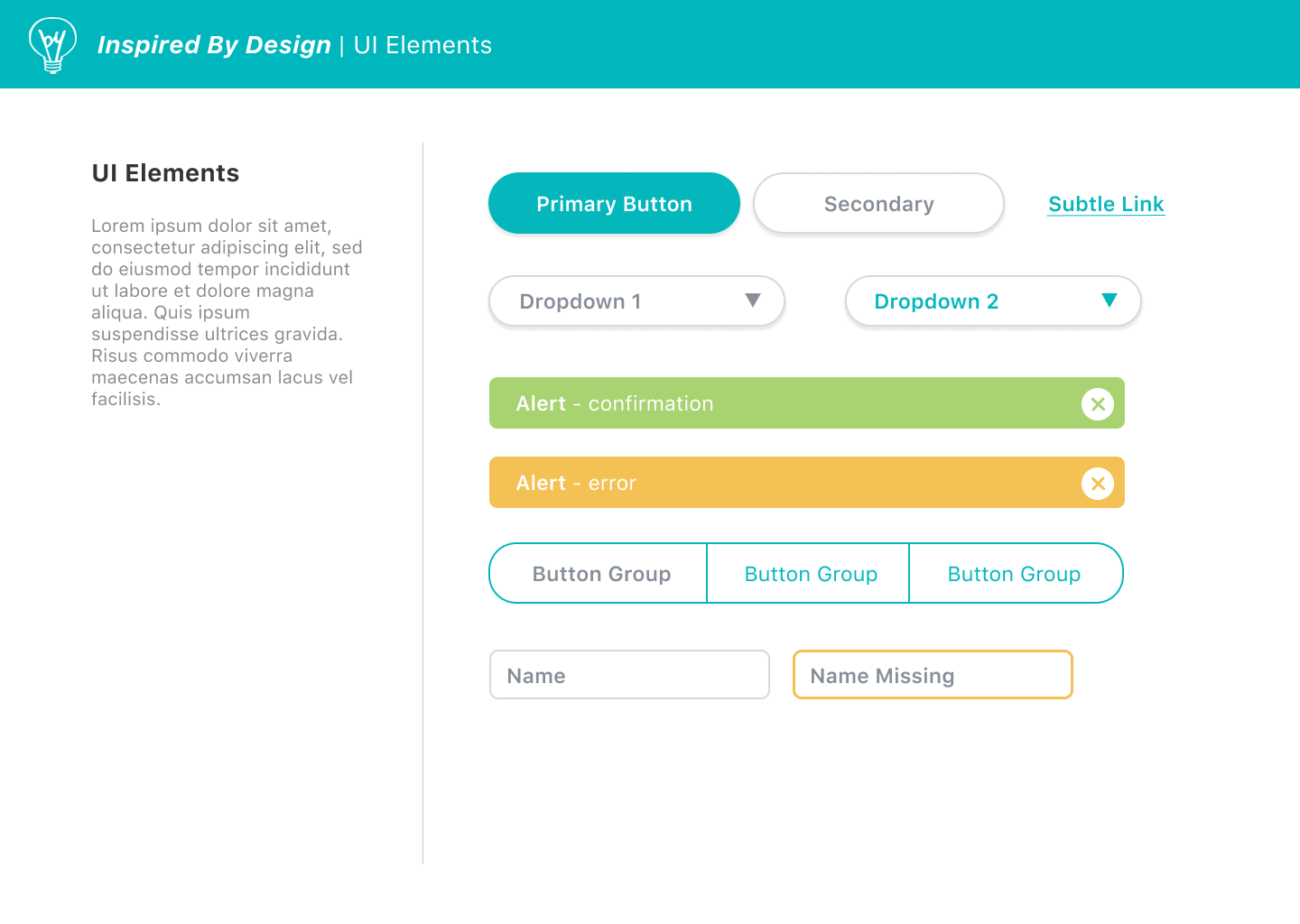
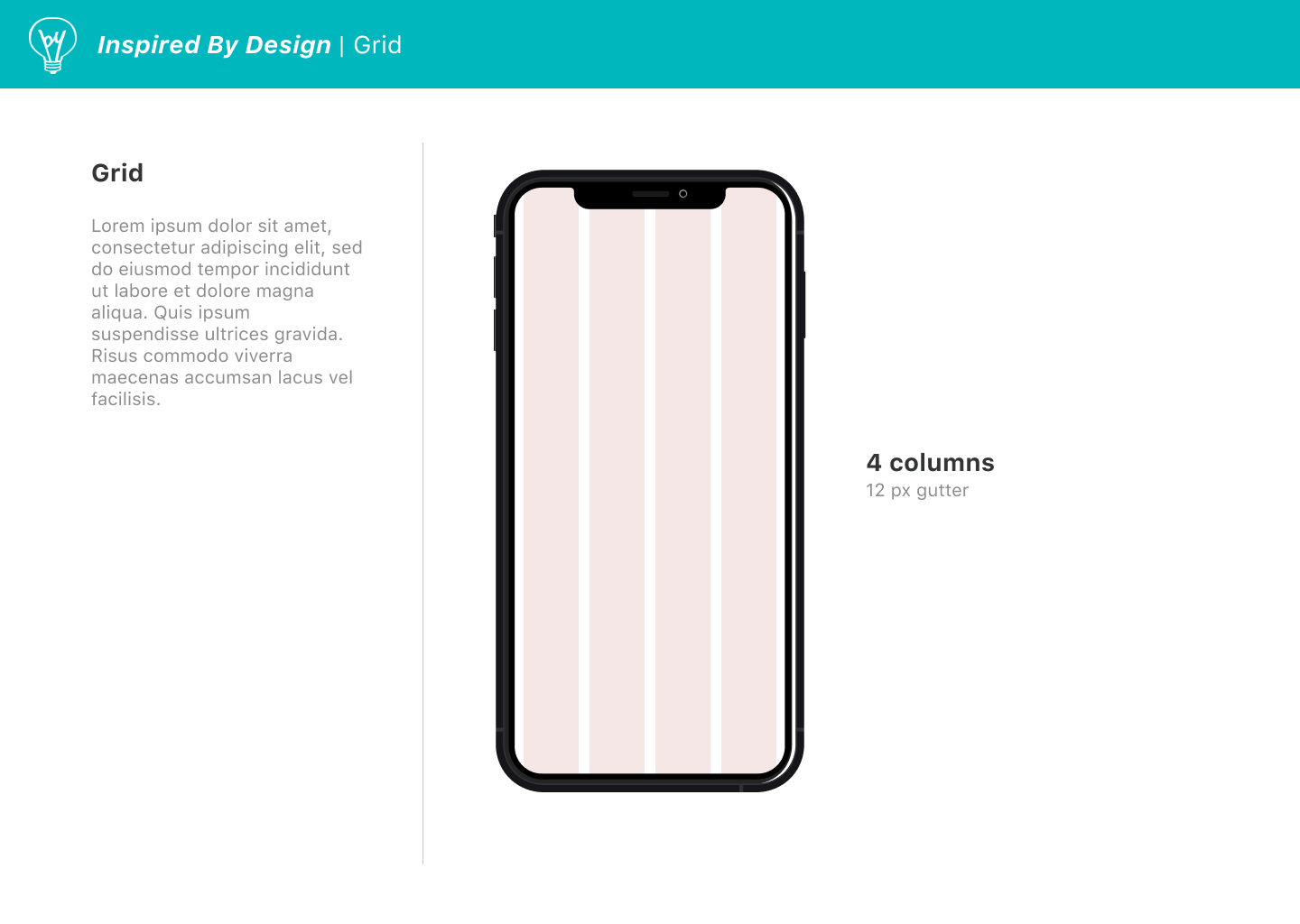
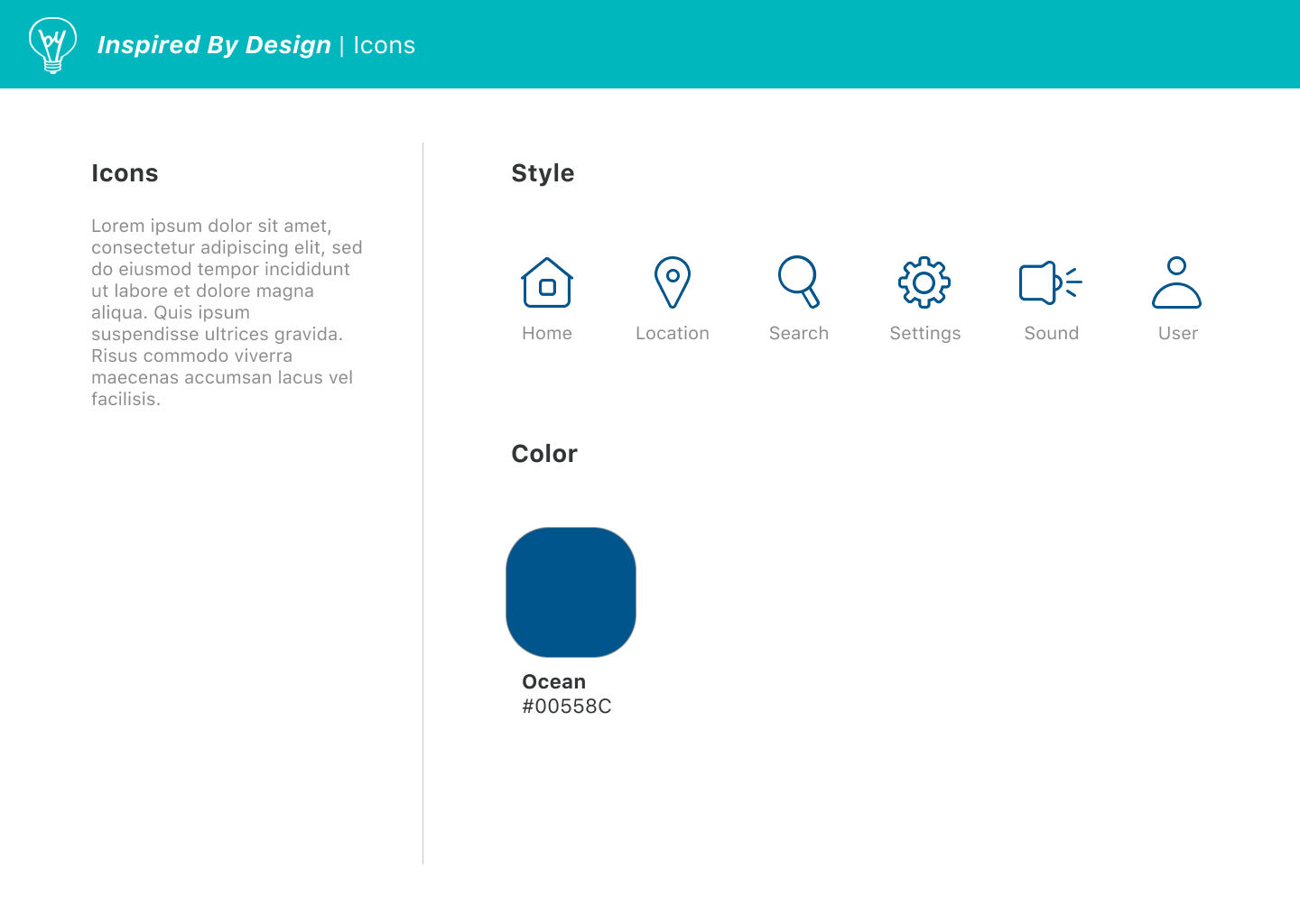
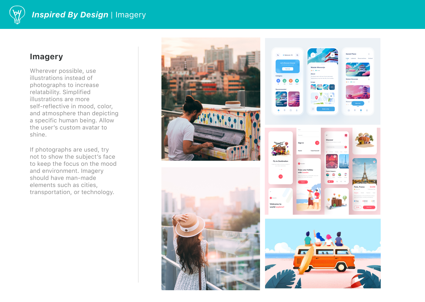
I decided to name this app "inspired by rain" to reflect the origins of the idea, and the whimsical tone I want to portray. To keep it light and playful, branding guidelines involve rounded button shapes and a bright, colorful palette with the use of illustration.
